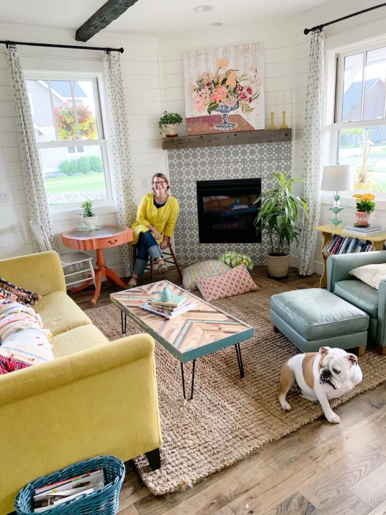
Guess what? We’re fully unpacked and settled in our new home. OMG! I’m certain that all of the rooms will continue to change and emerge and evolve as we layer our living and experiences into this new home, but the main components are in. It feels so, so good to be here, to LIVE here, to create here, to lounge here, to cultivate a whole new + slower life here.
I thought I’d give you a tour of our living room. It’s MUCH smaller than our old living room, and we love it so. It’s cozier, brighter, and contains less stuff (we’ve been on a less is more kick over here).
Enjoy the tour! Lots and lots of sources/links for you, too!

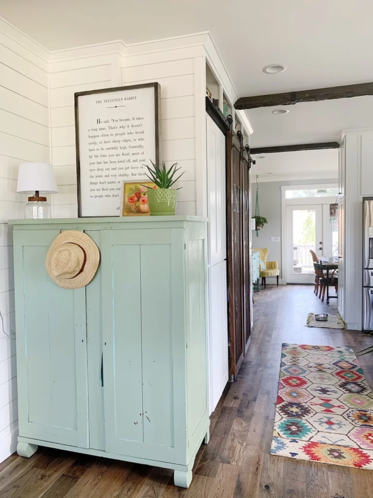
This is the view from our front door. I love the green cabinet/closet! It was a hand-me-down from my mom and it works really well as a closet in this space for our hats, coats, scarves, shoes, etc.. We use the vintage dresser on the left to hold our keys.

In this room and throughout the house, my goal was to create and include the following elements:
Shiplap/woodwork on the walls. Love the look, but love it even more as a backdrop to vibrant, colorful belongings. You’ll see it a lot in our house, especially downstairs.
Wood. We wanted to bring in a touch of rustic throughout the whole house without going overboard. You’ll see it in our mantels, ceiling beams, furniture and more.
Grey. Whether it’s in the tile or on the walls or furniture, we wanted it to weave this color throughout the house so there was a consistent calming color to go along with all the vibrant colors we have in our furnishings. Speaking of grey, we did something we’ve never done before and chose to paint ALL the non-shiplap walls in the house my favorite color gray: Stonington Grey by Benjamin Moore. I LOVE IT. More on that for another blog post as the walls in the living room are white (Fondont by Sherwin Williams)
Iron. We played with iron elements as a way to bring in a modern farmhouse vibe to all the wood and shiplap. You’ll see it in our curtain rod choices, our lighting choices, and more.
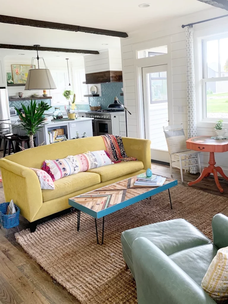
The living room is connected to the kitchen, making it sort of one big room. We’ve never had one big great room before and I’m loving it! It was a little tricky making the two rooms blend, but sticking to an overall color palette has helped (sea greens, corals, yellows, and a touch of navy blue).
Sources:
The yellow couch. It’s another hand-me-down from my mom (we have done a lot of furniture swapping lately as we both moved and our furniture needs have changed!). She bought it about 8 years ago from Crate + Barrel (many similar styles right here). Of course, the yellow is SO our color and the size is a nice petite size for this room. Eventually, I imagine getting a new sofa, but this works perfectly for our current budget.

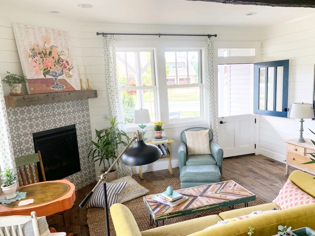
The rustic wood that we wanted to weave through the whole house shows up here in the coffee table, the mantel, and in the ceiling beams.
Sources:
The jute rug. I love this rug. Truthfully, it’s too small and we’ll soon get a larger rug soon as it’s driving me a little nuts that it’s not quite taking up the whole space (likely the same rug, just larger.) I love how the jute plays nicely with the rustic wood elements (the ceiling beams, etc) while also not overpowering the space with TOO much color. This particular rug is the most comfortable jute I’ve ever owned. I found it on Wayfair and highly recommend it!
The Ceiling Beams. Confession: They’re fake! And we love them. Again, it was a budget decision. Looking at them, you’d never know they’re fake. We used them as part of our wood element on the bottom floor to merge the kitchen and living room together. Love how they turned out!
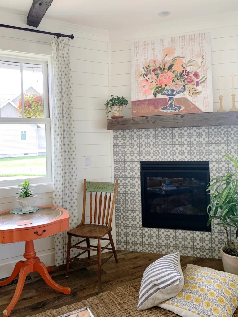
I am IN LOVE with the tile we chose for the fireplace. It brings in the grey that we wanted but also a charming pattern that we fell in love with. Also LOVING this painting from Lulie Wallace. It was in our guest bedroom in our old house but I love, love, love it taking center stage here in the living room. It makes the coral of the table pop!
Sources:
Fireplace tile. I bought the tile from Wayfair. Be warned, however, and make sure you get all the correct tile. Because if you look closely, these tiles don’t match on our fireplace. We chose to keep it, embracing the imperfection of a new build. Can you spot the mismatched tile?
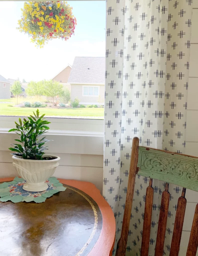

We were able to create a little sitting nook/game table that looks out the window and up into the sweetest little bird’s nest on the porch.
I loooooooove these curtains. They add interest and texture without being overwhelming and they complement the fireplace tiles well.
Sources:
The table and chairs. They’re vintage. I painted the table years ago with a coral color I can’t recall. Floor pillows were purchased years ago from a flea market.
Iron curtain rods: We bought these for just about every room in the house. They are inexpensive, extremely easy to install, and do the job well! Highly recommended.
Curtains. They’re made from fabric (Moda fabric # 12560, color #11). LOVE and gratitude to my mom for making them. She has made all my curtains for me since I was a kid!! I found the fabric at my local fabric store, but I’m sure it’s online somewhere!

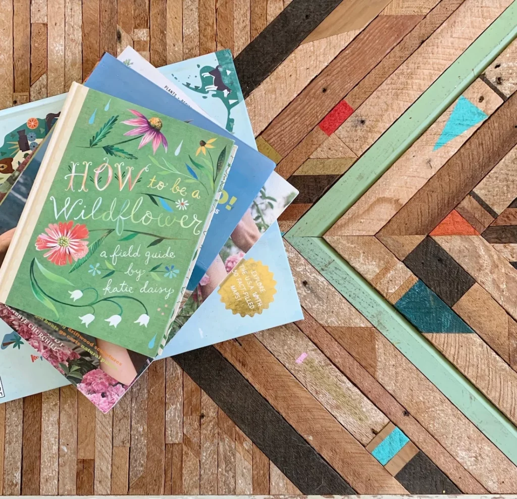
Can we please talk about this coffee table? We didn’t have a coffee table that would work in this room. After roaming the internet for a circular table, I had the idea to convert a piece of wall art that we already owned into a coffee table. And I LOVE LOVE LOVE how it turned out. I simply bought a package of hairpin legs and screwed them into the art and voila, a coffee table!
Sources:
Coffee table legs: These are the hairpin legs I purchased to convert the wall art (maker unknown) into a coffee table.
Coffee table book: It’s written by my dear friend Katie Daisy and you must must have one!
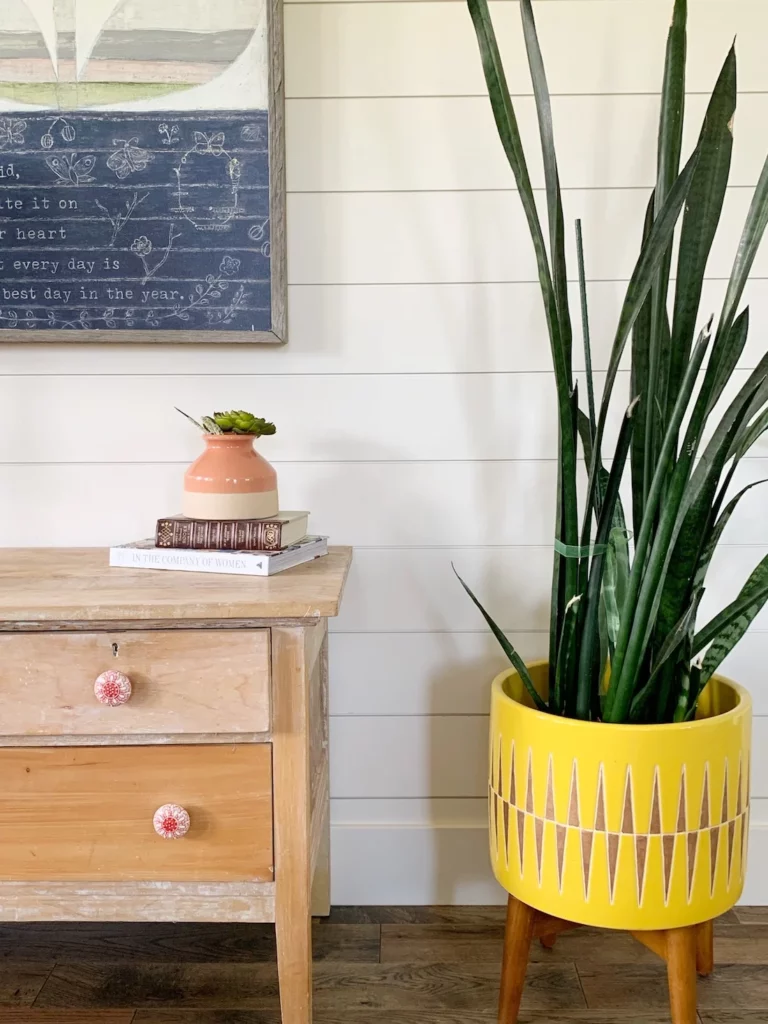
Yellow plant stand: I purchased this a couple of years ago at West Elm. You can find similar ones here.
Long couch pillow: I splurged on the long pillow (as the sofa was free!) and I’m so glad I did!
Sugarboo Wall art: Gosh, I love ALL of her things. This flower wall art was in our entryway at our old home, but I sure love it here in our new living room. I especially love how it invites more navy blue (grounding) into this space.
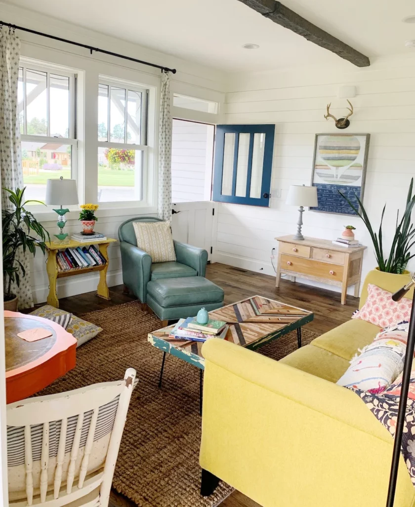
One of the best decisions we made was spending the extra money for a dutch door. We painted it coral but then we painted in navy blue (Hale Blue from Benjamin Moore). I’m certain it will have a different color as the years go on. I love changing things up.
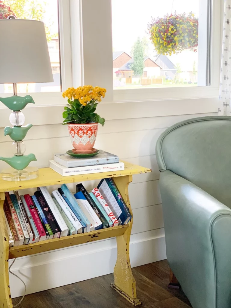
The vintage bookshelf table (found at a garage sale for $10!) balances the yellow color in this room beautifully while the sea green chair marries well with the coffee table and the sea green closet/hutch we have in this room as well.
Sources:
The sea green leather chair. We bought this years ago at Crate + Barrel. It was a floor model and we went for it. I love the color! It’s still available over here.
Birdie Lamp: Fun fact: This lamp was part of my home decor collection years ago with Creative Co-op. It’s no longer in production but you can find similar versions everywhere. Oh, wait! I just found it right here!
Here’s the view from the kitchen. What do you think?
Sources:
Reading Lamp: Super affordable (not super sturdy, but works for us) from Target. I wanted to bring a bit of the black/iron vibe in a bit more to this room and it does the trick. Similar option available here!

I hope you enjoyed the tour!
Here’s to decorating our joy! For me in this particular season of life, that means more color, less stuff, more light, and easy spaces that invite lounging, creativity, and living. More room tours coming soon!
Last of the sources:
Velveteen Rabbit wall art: This is another piece from Sugarboo. The flower art propped up on it is vintage.
PS: Some of the source links are affiliate links, which means I make a small commission if you purchase anything 🙂
BIG LOVE!
